Climate Change Without the Panic and Without the Denial
Most conversations about climate change become confused because several questions are argued at once.
Is the planet warming? Are human emissions responsible? Which countries caused the problem historically? Which countries are making it worse today? Is Europe doing enough? Is China the problem? Are rich countries simply outsourcing their emissions? Are climate policies meaningful, or are they symbolic gestures by countries that no longer control the global emissions curve?
Those are different questions. They need different evidence.
The basic story is simple at first. Fossil-fuel emissions rose as industrial economies developed. Europe and North America industrialized first, burned coal, oil, and gas first, and therefore carry a large share of historical responsibility. Later, emissions growth spread as the rest of the world developed. In recent decades, Europe bent its emissions curve downward. North America and the United States improved more weakly. But global emissions did not fall, because emissions growth in China, India, and the rest of Asia more than offset reductions elsewhere.
That is the core tension.
The West started the fossil-fuel age. But the marginal emissions problem is no longer primarily Western. Climate politics often fails because it wants only one of those sentences to be true.
This article is an attempt to hold both at the same time.
It is not an argument for climate fatalism. It is also not an argument for climate theater. The goal is to understand what happened, what is happening now, and what would have to happen next for global emissions to actually fall.
Data And Method
The analysis uses the Our World in Data complete CO2 dataset, downloaded on 2026-07-01. The underlying source listed by OWID for the core emissions variables is the Global Carbon Budget.
The main unit is annual fossil and industrial CO2 emissions, measured in million tonnes of CO2 per year. This excludes land-use change unless stated otherwise.
The physical-climate opening uses direct modern measurement series: NASA GISTEMP v4 for land-ocean surface temperature, NOAA Global Monitoring Laboratory CO2 concentration as distributed by OWID, NOAA Total Solar Irradiance CDR, NOAA/NCEI ocean heat content as distributed by OWID, NSIDC Arctic sea ice extent as distributed by OWID, and the WGMS reference-glacier mass-balance CSV.
The scripts are in analysis/scripts/. Generated tables are in analysis/tables/. Generated figures are in analysis/figures/.
The most important computed fields are:
- NASA temperature anomaly: annual
J-Dvalues from NASA GISTEMP’s global, Northern Hemisphere, and Southern Hemisphere public CSV tables. - Temperature variable definition: GISTEMP is a monthly land-ocean temperature index aggregated to annual means, not a daily maximum-temperature series.
- Daily-temperature reproducibility note: a daily-average version is possible for narrower domains with station or gridded daily products, such as NOAA GHCN-Daily station records or NOAA nClimGrid-Daily for the contiguous United States. A true global daily land-ocean average requires a separate gridding and ocean-data workflow, so this article uses the standard monthly/annual global products for the main global claim.
- Alternative anomaly baseline: NASA annual anomaly minus the 1991-2020 average of the same NASA annual series.
- CO2 concentration: NOAA annual atmospheric concentration in parts per million.
- Solar comparison: NOAA yearly total solar irradiance, with an 11-year moving average for the solar-cycle panel.
- Ocean heat content: monthly NOAA/NCEI 0-2000m ocean heat content averaged by year.
- Arctic sea ice: NSIDC September extent, because September is the annual minimum season.
- Glacier mass balance: WGMS cumulative reference-glacier mass balance relative to 1970.
- Annual emissions: direct OWID
co2values. - Cumulative emissions: direct OWID
cumulative_co2values. - Per-capita emissions: direct OWID
co2_per_capitavalues. - Consumption-based emissions: direct OWID
consumption_co2values. - Change since 1990:
(latest / 1990 - 1) * 100. - Europe + North America counterfactual: combine Europe and North America emissions, index that combined series to 1990 = 1.0, then apply that index to 1990 World emissions.
- Year-over-year change:
emissions_this_year - emissions_previous_year, smoothed with a five-year rolling average. - Waterfall contribution:
co2_2024 - co2_1990for each broad region or country group. - Indexed development chart:
value_year / value_1990 * 100for CO2, GDP, and CO2 per GDP. - Fuel split: direct OWID
coal_co2,oil_co2,gas_co2,cement_co2, andflaring_co2. - Trade CO2: direct OWID
trade_co2, which is the gap between consumption-based and territorial emissions.
Physical Context: Why The Accounting Matters
Before the emissions accounting, there is a simpler question:
Is climate change actually happening?
For this opening section, I am deliberately staying close to direct measurement. No ice cores. No tree rings. No deep paleoclimate reconstruction. Those are important for longer historical context, but they are not necessary to establish the modern fact pattern. The relevant question here is narrower: what do modern instrumental records show?
The main official temperature source used here is NASA GISTEMP v4, NASA’s global land-ocean temperature index. NASA describes GISTEMP as an estimate of global surface temperature change that uses NOAA’s Global Historical Climatology Network station data over land and NOAA’s Extended Reconstructed Sea Surface Temperature data over the ocean. The public NASA table reports temperature anomalies, not absolute temperatures.
That matters because a common skeptical argument begins here:
“Temperature anomaly” sounds like a statistical trick. Is this maximum temperature? Why not use the real temperature?
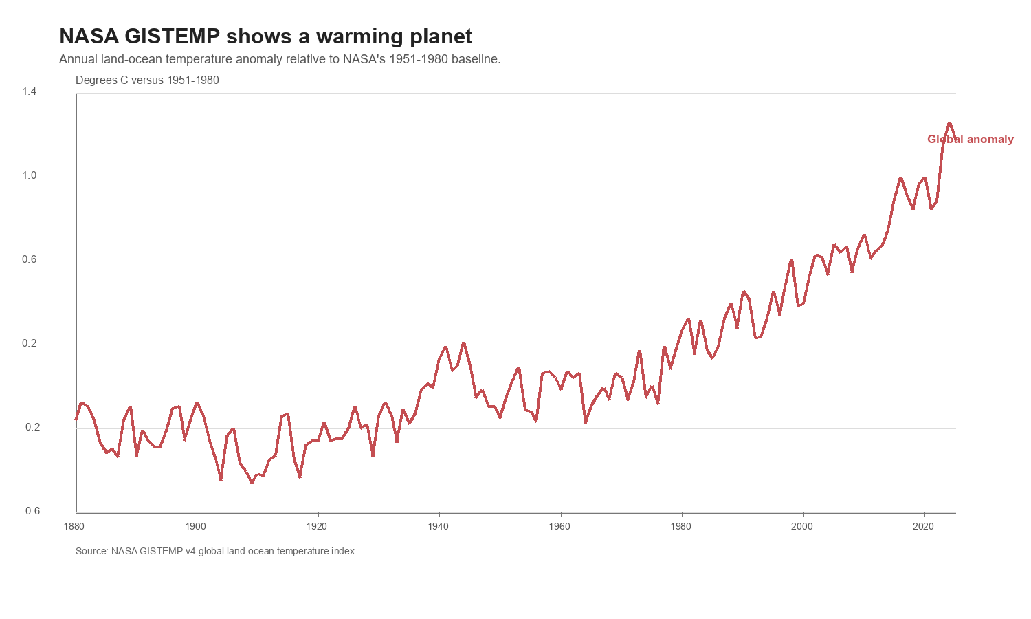
An anomaly is not a model trick. It is the measured temperature minus a reference-period average. In this NASA table, it is not daily maximum temperature. It is a land-ocean surface-temperature index: land surface air temperature over land combined with sea-surface temperature over oceans, aggregated into monthly and annual means. NASA’s standard GISTEMP table uses 1951-1980 as the reference period. If a year is reported as +1.19 C, that means the year was 1.19 degrees Celsius warmer than the average year in that baseline. The baseline controls the zero line, not the trend.
How this was computed:
The script reads NASA’s public GLB.Ts+dSST.csv GISTEMP table and uses the annual J-D column. In this downloaded version, the global annual anomaly rises from about -0.18 C in 1880 to about +1.19 C in 2025, measured against NASA’s 1951-1980 baseline.
Consequence for the argument:
The global instrumental surface-temperature record shows warming. That does not, by itself, settle attribution or policy. But it does answer the first question. If the claim is “the measured global surface record does not show warming,” the claim fails.
The First Physical Rebuttal: The Baseline Does Not Create The Trend
The next skeptical argument is more technical:
The warming depends on which baseline you choose.
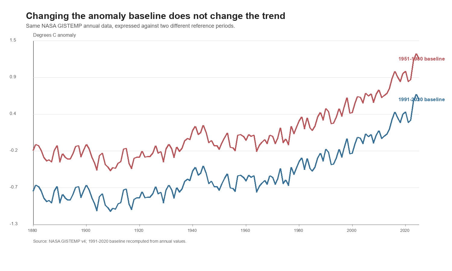
This is partly true and mostly irrelevant. The numerical anomaly for a specific year changes when the baseline changes. The shape of the series does not.
How this was computed:
The red line is NASA’s published annual anomaly relative to 1951-1980. The blue line uses the same annual NASA values, but subtracts the 1991-2020 average from each year. That re-expresses the same record against a later, warmer reference period.
Consequence for the argument:
Changing the baseline moves the line up or down. It does not turn a warming series into a flat one. The argument can change the label on the y-axis. It cannot erase the measured rise.
The Second Physical Rebuttal: It Is Not Just One Hemisphere
Another reasonable check is whether the global number hides regional averaging artifacts:
Maybe the warming is an artifact of where the measurements are taken.
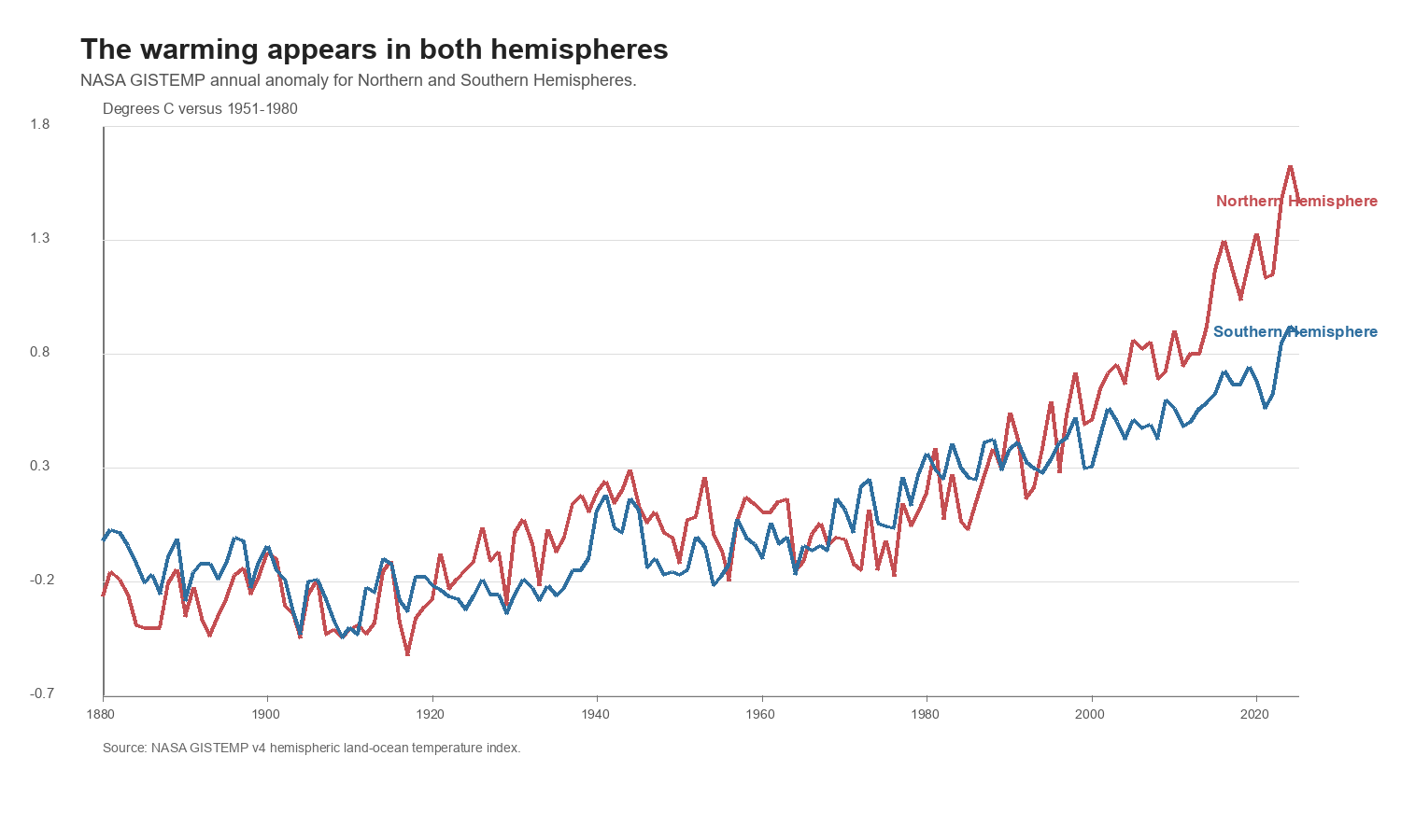
NASA publishes hemispheric land-ocean series as well. They are not identical, and they should not be. The Northern Hemisphere has more land, more industry, and different ocean circulation. But the broad signal appears in both hemispheres.
How this was computed:
The script reads NASA’s Northern Hemisphere and Southern Hemisphere GISTEMP annual tables and plots the same annual J-D anomaly column used for the global chart.
Consequence for the argument:
This does not prove every local place warmed by the same amount. It shows that the modern warming signal is not confined to one side of the planet or one isolated temperature series.
The Third Physical Rebuttal: CO2 And Temperature Rose Together
The next step is to put the temperature record beside atmospheric CO2:
CO2 may be rising, but that does not mean it has anything to do with temperature.
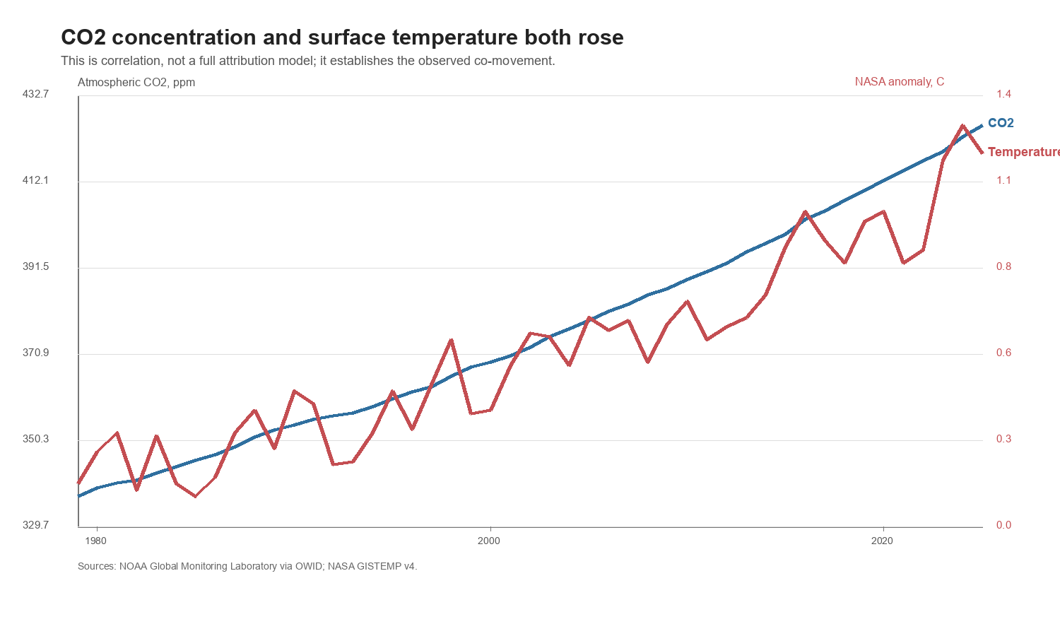
The chart below is not a full attribution model. It does not include aerosols, volcanoes, ocean cycles, land-use changes, or all radiative forcings. It makes a narrower point: atmospheric CO2 and global temperature have both moved sharply upward over the modern measured period.
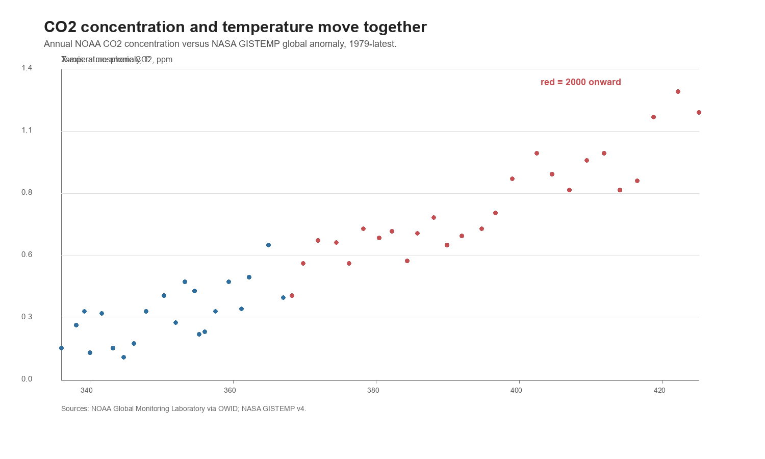
How this was computed:
The CO2 series uses the NOAA Global Monitoring Laboratory concentration extract distributed through Our World in Data. The temperature series is the NASA GISTEMP annual global anomaly. In the local summary table, atmospheric CO2 rises from about 337 ppm in 1979 to about 426 ppm in 2025. Over the overlapping period, the NASA global temperature anomaly rises as well.
Consequence for the argument:
Correlation is not enough for final attribution. But it is enough to reject the weaker claim that the CO2 record and the temperature record are unrelated in the observed data. If someone wants to argue against human-caused warming, they need a better explanation for why the measured temperature rose while measured greenhouse-gas concentration rose.
The Fourth Physical Rebuttal: What About The Sun?
The strongest simple alternative explanation is solar:
Maybe the planet is warming because the Sun got stronger.
That is a good thing to test because solar output is measured. NOAA’s Total Solar Irradiance Climate Data Record provides a yearly solar irradiance series. If solar forcing were the simple explanation for the recent warming, the solar series should show an upward trend that matches the temperature rise.
It does not.
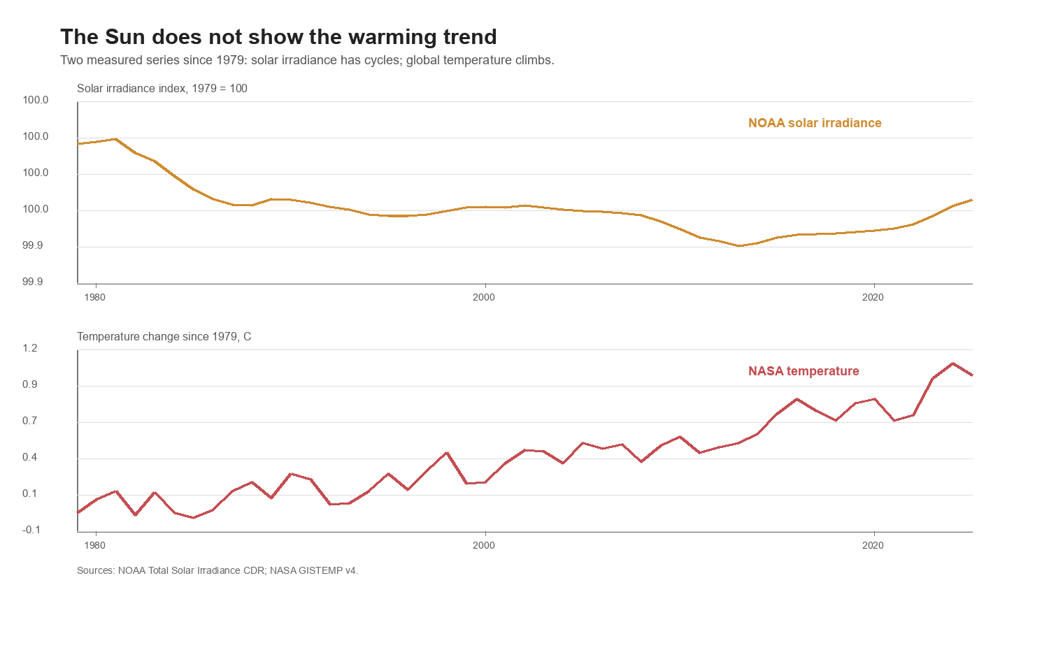
How this was computed:
The top panel uses NOAA’s yearly Total Solar Irradiance CDR, smoothed with an 11-year moving average to avoid confusing the solar cycle with the longer trend. The bottom panel uses NASA GISTEMP and expresses temperature as change since 1979, the start of the CO2 concentration extract used here.
Consequence for the argument:
The Sun varies. But in this measured period, solar irradiance does not show the same upward march as surface temperature. Solar variation may matter for short-term variability, but it does not explain the modern warming trend shown here.
The Fifth Physical Rebuttal: What About Milankovitch Cycles?
Another natural-climate argument is orbital:
Earth’s climate has always changed because of Milankovitch cycles.
This is true as a statement about long-run Earth history. Milankovitch cycles are changes in Earth’s orbit, axial tilt, and wobble. They influence how sunlight is distributed across latitudes and seasons, and they matter for glacial-interglacial cycles.
But this is not the same as explaining the modern warming trend. The relevant timescales are wrong. Milankovitch cycles operate over tens of thousands to hundreds of thousands of years. The warming shown in the modern instrumental record is concentrated over roughly the last century, with the sharpest rise since the late twentieth century.
How this was evaluated:
This section does not need a new proxy reconstruction. It compares mechanisms and timescales. NASA’s explanation of Milankovitch cycles treats them as slow orbital changes. The measured temperature record used above is annual instrumental data since 1880. The modern CO2 record used above is direct atmospheric measurement since 1979. A process whose main cycles unfold over ~20,000, ~40,000, and ~100,000-year scales is not a good explanation for the observed decade-scale acceleration.
Consequence for the argument:
Milankovitch cycles are real. They are not a useful explanation for the current warming episode. Invoking them correctly means acknowledging their timescale; using them to dismiss measured modern warming is a category error.
The Sixth Physical Rebuttal: What About The Magnetic Poles?
The magnetic-pole argument is similar:
The magnetic poles are moving, so maybe that is causing climate change.
The first half is true. The magnetic poles move. NOAA tracks this through geomagnetic models such as the World Magnetic Model, which is updated every five years for navigation, heading, and related systems. NOAA’s 2025 magnetic-pole page gives a specific current modeled location for the North Magnetic Pole and South Magnetic Pole.
But a moving magnetic pole is not the same thing as an energy imbalance that warms the lower atmosphere and oceans. The surface warming, ocean heat accumulation, CO2 increase, and sea-ice decline shown here are energy-and-heat indicators. The magnetic-pole drift record is a geomagnetic-navigation record. It can affect compass declination and navigation models. It does not provide a measured upward solar-energy trend, and it does not explain why ocean heat content rises while atmospheric CO2 rises.
How this was evaluated:
The article already tests the most direct solar-energy version of this family of arguments: total solar irradiance. NOAA’s solar irradiance record does not show the same upward trend as NASA’s temperature record over the modern measured period. Magnetic-pole drift is therefore not a substitute explanation for the missing solar-energy trend.
Consequence for the argument:
Magnetic-pole movement is real. It is not evidence against modern climate change, and it is not a competing attribution mechanism for the warming pattern shown in the direct physical measurements above.
The Seventh Physical Rebuttal: The Oceans And Ice Also Move The Same Way
Surface air temperature is not the only measured signal.
If the planet is accumulating heat, the oceans should matter because they store most of the excess heat. NOAA/NCEI publishes ocean heat content estimates; the extract used here reports monthly heat content for the 0-2000 meter ocean layer.
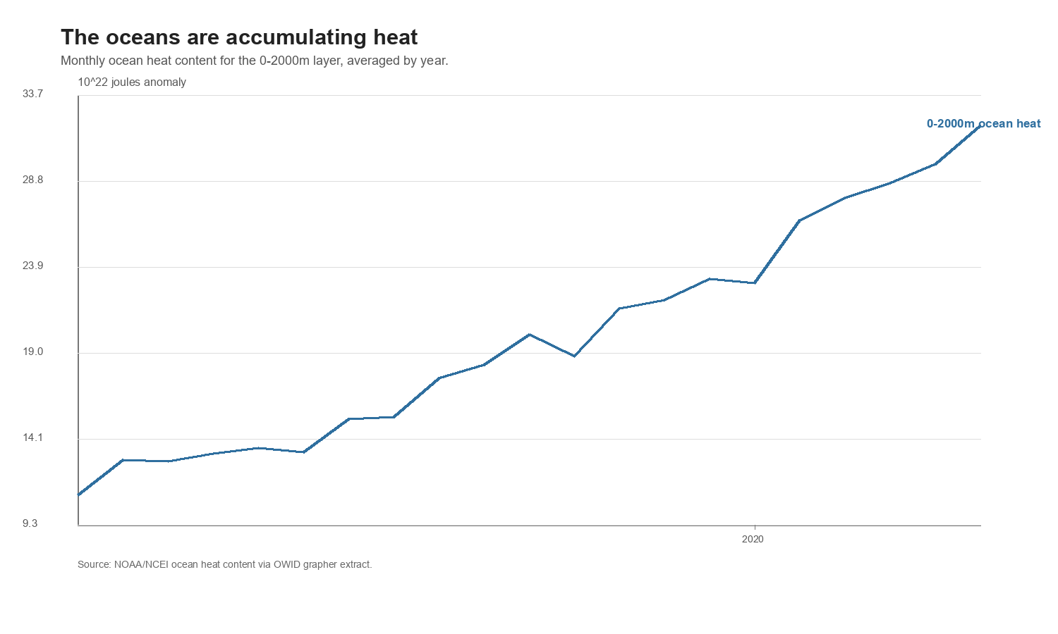
How this was computed:
The script reads the monthly NOAA/NCEI ocean heat content extract distributed by OWID and averages months by year. In the downloaded data, the annual average 0-2000m ocean heat content anomaly rises from about 10.9 to about 32.0 in units of 10^22 joules between 2005 and 2025.
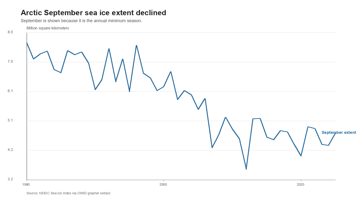
Ice gives another check. Arctic September sea ice is useful because September is the annual minimum season. The NSIDC-derived series used here falls from about 7.7 million square kilometers in 1980 to about 4.7 million square kilometers in 2025.
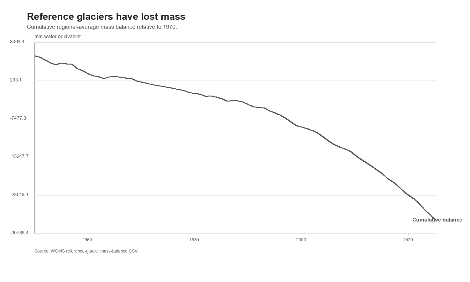
Glaciers are not a global thermometer, and individual glaciers respond to local precipitation and geography. But the World Glacier Monitoring Service reference-glacier mass-balance series gives another independent physical check.
How this was computed:
The glacier chart uses the WGMS reference-glacier mass-balance CSV and plots cumulative regional-average mass balance relative to 1970. In the downloaded file, the cumulative value falls from +5384 mm water equivalent in 1950 to -28109 mm water equivalent in 2025.
Consequence for the argument:
The surface temperature record is not standing alone. Ocean heat content rises. Arctic September sea ice extent falls. Reference glaciers lose mass. These are different measurements, from different systems, pointing in the same direction.
This article therefore does not use emissions geography to relitigate whether climate change exists. The physical evidence says the modern climate is warming. The rest of the article asks the next questions: where annual emissions came from, who bears historical responsibility, and what future reductions would require.
The Simplest Claim: Global Emissions Are Still Rising
The first claim is the bluntest one:
Global CO2 emissions are still going up.
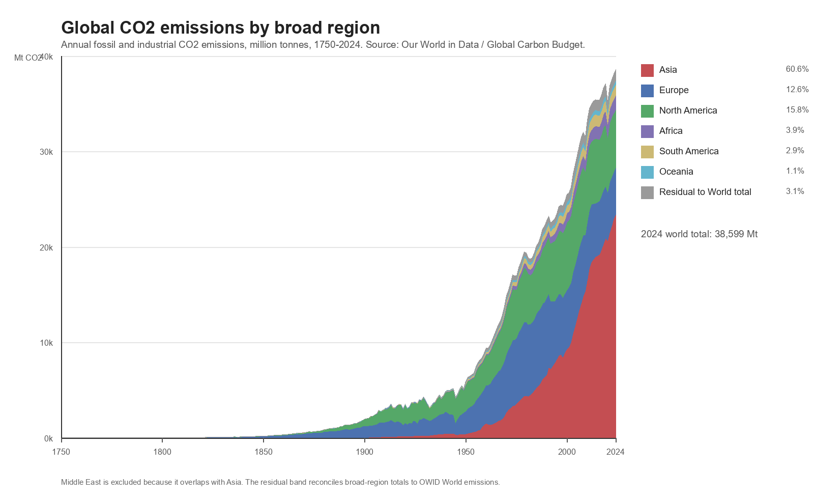
On annual fossil and industrial CO2 emissions, this is true.
How this was computed:
The chart uses OWID annual co2 values for broad non-overlapping regions: Asia, Europe, North America, Africa, South America, and Oceania. A residual band is added so that the stacked regional total reconciles to OWID’s World total. The Middle East is not stacked separately because it overlaps with Asia in the OWID regional taxonomy.
In the dataset used here, global annual CO2 emissions rose from about 22.7 billion tonnes in 1990 to about 38.6 billion tonnes in 2024. That is an increase of roughly 70%.
Consequence for the argument:
If the question is “Are global annual fossil CO2 emissions lower than in 1990?”, the answer is no. Some rich countries have reduced emissions. Some regions have reduced emissions. Some sectors have improved. But the world as a whole has not yet put annual fossil CO2 emissions onto a sustained downward path.
The First Rebuttal: Europe Has Reduced Emissions, But “The West” Is Too Broad
The next argument usually comes from someone looking at Europe or the broader West:
That global picture hides the fact that rich Western countries have already reduced emissions.
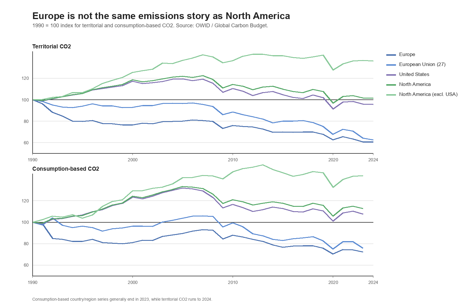
This is true for Europe. It is weaker for North America and the United States.
How this was computed:
The chart indexes territorial CO2 and consumption-based CO2 to 1990 = 100 for Europe, EU-27, the United States, North America, and North America excluding the United States. A value below 100 means emissions are below 1990. A value above 100 means emissions are above 1990.
Data check:
Europe’s territorial CO2 index fell to about 61 by 2024, and its consumption-based CO2 index fell to about 72 by 2023. EU-27 shows a similar decline. The United States is only slightly below 1990 territorially, at about 96, and above 1990 consumption-based, at about 108. North America overall is above 1990 on both territorial and consumption-based measures.
How this was computed:
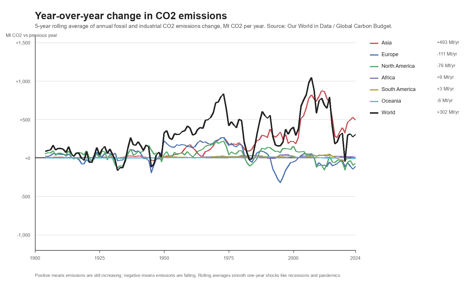
For each region, annual change is computed as co2_this_year - co2_previous_year. The chart shows a five-year rolling average of that annual change. Positive values mean emissions are increasing relative to recent years. Negative values mean emissions are falling relative to recent years.
Europe and North America are now negative on this recent smoothed change measure. That is not the same as saying both are below 1990 on total emissions. Asia remains strongly positive. In the latest five-year average, Asia is still adding roughly 493 million tonnes of CO2 per year, while Europe and North America are reducing relative to recent years.
Consequence for the argument:
The European reduction claim cannot be dismissed. North America also bent downward after its peaks, but its 1990-to-latest record is much weaker. This does not mean the climate problem is solved. It means the geography of the problem changed.
The Second Rebuttal: What If The World Had Followed The Western Path?
The natural follow-up is:
Would global emissions be falling if the rest of the world had followed the Europe and North America trajectory?
Yes, under this simple trajectory counterfactual.
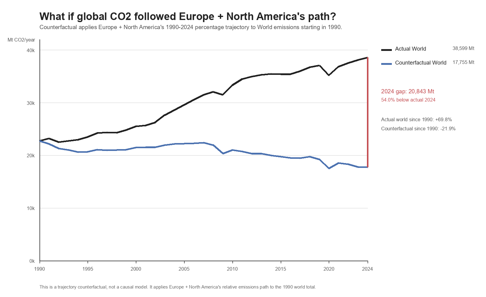
How this was computed:
First, combine Europe and North America annual CO2 emissions. Second, divide each year by the 1990 Europe + North America value to create an index where 1990 = 1.0. Third, multiply the 1990 World emissions value by that index.
This is not a causal model. It does not say the world could easily have followed that path. It shows arithmetic direction, not a realistic development pathway. It only asks what the global curve would look like if the world had changed at the same percentage rate as Europe + North America.
Result:
Actual World CO2 rose from about 22.7 billion tonnes in 1990 to 38.6 billion tonnes in 2024, a 69.8% increase. The counterfactual path falls to about 17.8 billion tonnes in 2024, a 21.9% reduction from 1990. The 2024 gap is about 20.8 billion tonnes.
Consequence for the argument:
If the global emissions path looked like the Western path, global emissions would be falling. The reason they are not falling is that growth elsewhere more than offset Western reductions.
The Third Rebuttal: The World Developed
The next claim is usually made by people skeptical of European climate policy:
Europe reduced emissions, but the rest of the world developed and overwhelmed those cuts.
This is broadly true on annual emissions.
Asia is now the dominant annual-emissions region. China is the largest country emitter. India is third. Africa and South America remain much smaller in absolute terms, but their development trajectories also point upward rather than downward.
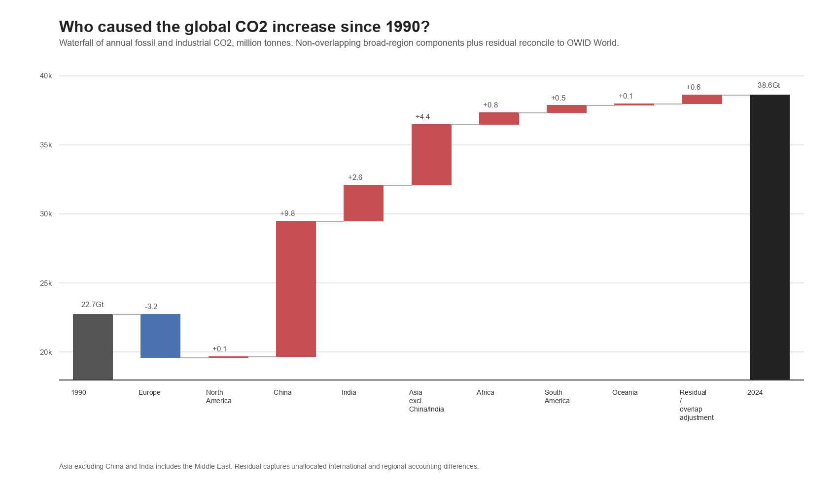
How this was computed:
The waterfall computes co2_2024 - co2_1990 for each component. Europe reduced annual CO2 by about 3.2 billion tonnes. North America increased slightly, by about 0.1 billion tonnes. China added about 9.8 billion tonnes. India added about 2.6 billion tonnes. Asia excluding China and India added about 4.4 billion tonnes. Africa, South America, Oceania, and residual accounting differences explain the rest.
The regional area chart uses annual co2 values. The top-emitter tables rank country-level annual co2 values in 2024 and consumption-based consumption_co2 values in 2023.
Consequence for the argument:
This should not be framed as moral blame. The waterfall answers an arithmetic question: if Europe fell, why did the world rise? Mostly because China, India, and the rest of Asia grew. Development requires energy. Countries building housing, factories, roads, ports, electricity grids, steel production, fertilizer systems, transportation networks, and middle-class consumption will use more energy. Historically, that energy has usually come from fossil fuels.
The difficult climate question is not whether poorer countries should remain poor. They should not. The question is whether developing countries can grow without repeating the high-carbon path rich countries used.
The Fourth Rebuttal: Annual Emissions Are Not Historical Responsibility
At this point someone will object:
Current annual emissions are not the same thing as historical responsibility.
Correct.
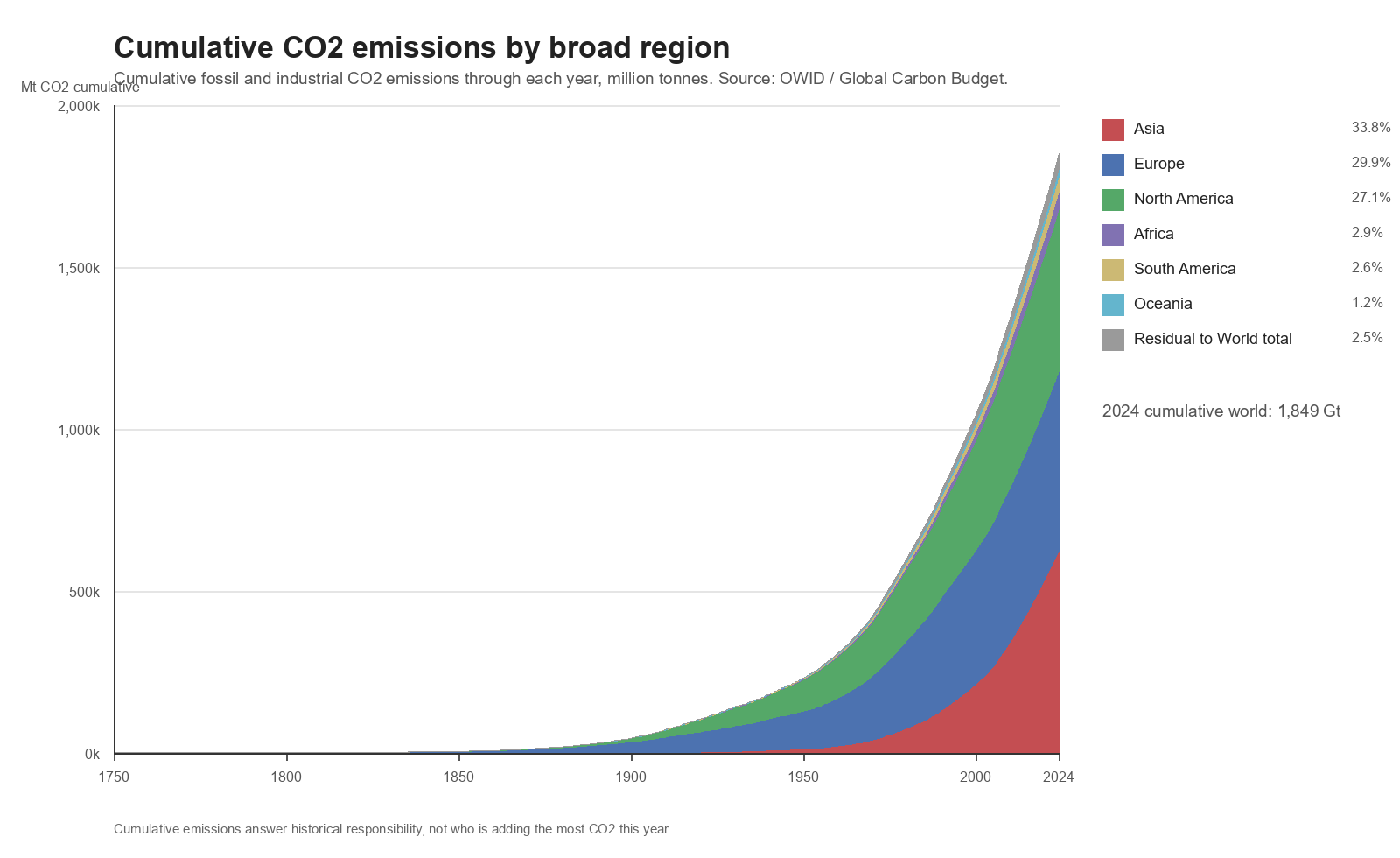
How this was computed:
The chart uses OWID cumulative_co2 values by broad region. Like the annual stacked chart, it includes a residual band to reconcile the broad-region stack to the World total.
Annual emissions answer one question: who is adding CO2 now?
Cumulative emissions answer another question: who emitted the most over history?
This distinction matters because CO2 accumulates in the atmosphere. Climate change is not caused only by this year’s emissions. It is caused by the stock of greenhouse gases built up over time. Europe and North America industrialized first, emitted first, and became rich under a fossil-fuel energy regime.
Consequence for the argument:
If someone uses annual emissions alone to say China is the whole problem, they are ignoring history. If someone uses cumulative emissions alone to avoid discussing current and future emissions growth in Asia and developing regions, they are ignoring the future.
A serious climate argument needs both.
The Fifth Rebuttal: Per-Capita Emissions Matter
The next claim is about fairness:
China and India are large only because they have many people. Per person, rich countries still emit much more.
This is important, but it is not the whole story.
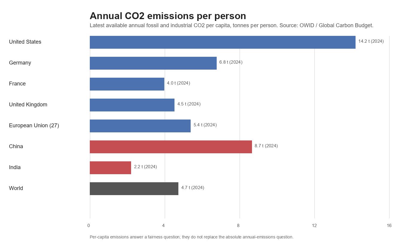
How this was computed:
The chart uses the latest available OWID co2_per_capita values for selected countries and regions. It measures territorial fossil and industrial CO2 per person per year.
Absolute emissions identify scale. Per-capita emissions identify fairness and lifestyle intensity.
The United States remains very high per person. India remains low per person. China is now above the EU and Germany in the latest territorial snapshot in this first-pass data, which is important because the “China is still low per person” argument is no longer as simple as it once was. This is territorial per-capita CO2; consumption-based per-capita accounting should be checked separately before making the same claim about consumption.
Consequence for the argument:
Per-capita emissions strengthen the fairness argument for developing countries, especially India and poorer regions. But per-capita emissions do not settle the physical emissions problem. The atmosphere responds to tonnes. A country can be low per person and still matter globally if it is large and growing.
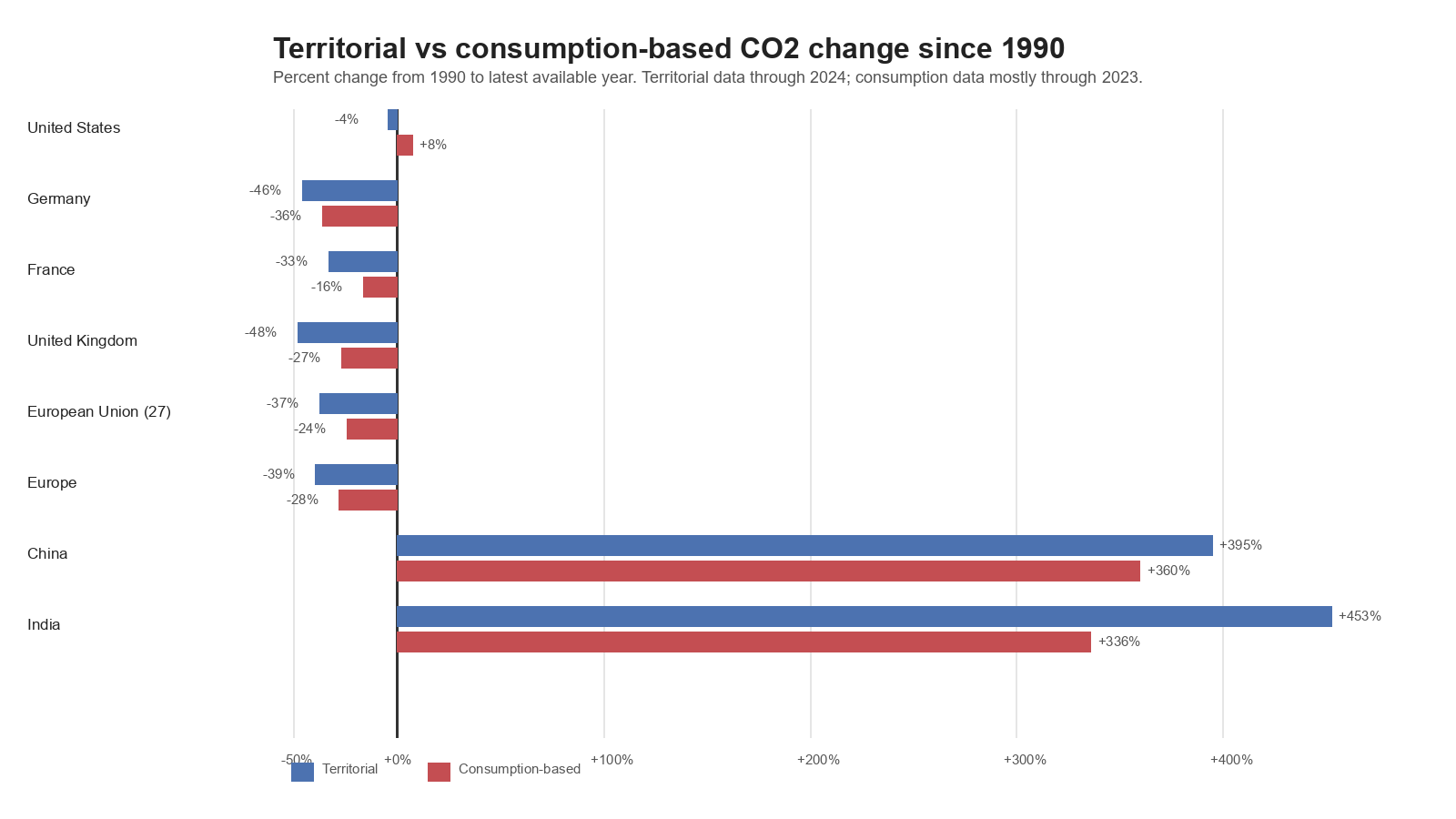
The Sixth Rebuttal: The West Outsourced Its Emissions
Then comes one of the strongest objections to the Western-reduction story:
Western emissions only fell because manufacturing moved to China and other countries.
This is the offshoring argument. It is serious and should not be waved away.
How this was computed:
For each selected country or region, the chart computes:
territorial change = (latest co2 / 1990 co2 - 1) * 100
and:
consumption change = (latest consumption_co2 / 1990 consumption_co2 - 1) * 100
Territorial data run through 2024. Consumption-based country data generally run through 2023.
Territorial emissions measure where CO2 is produced. Consumption-based emissions estimate the emissions embodied in what a country consumes, regardless of where production occurred.
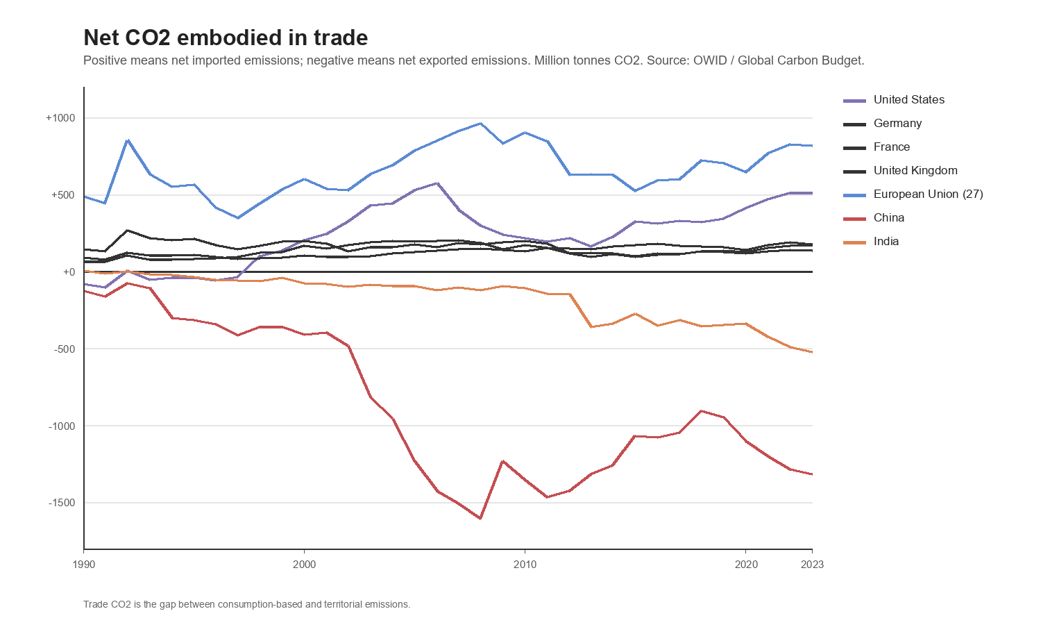
The trade chart uses OWID trade_co2, which is the gap between consumption-based and territorial emissions. Positive values mean a country or region is a net importer of embodied CO2. Negative values mean it is a net exporter of embodied CO2.
Consequence for the argument:
The offshoring critique matters, but it does not erase European reductions. Germany, France, the United Kingdom, Europe, and the EU show declines even after consumption adjustment, though the declines are smaller. The United States looks weaker: territorial emissions are slightly below 1990, but consumption-based emissions are above 1990. The trade chart also shows the structural pattern: the EU and United States are net importers of embodied CO2, while China and India are net exporters in the latest data.
Western reductions are not entirely fake. But territorial accounting overstates the cleanliness of rich consumer economies. Any honest analysis must show both.
The Seventh Rebuttal: Germany And Europe Are Too Small To Solve This Directly
Another argument, common in Germany and Europe, is:
Further German or European reductions are a drop in the bucket compared with China and Asia.
On direct annual arithmetic, this is largely true.
How this was computed:
The share figures use OWID share_global_co2 and the annual co2 values. In the first-pass 2024 data, Germany is about 1.5% of global annual fossil CO2. The EU-27 is about 6.3%. Asia is about 60.6%. China alone is about 31.8%.
Consequence for the argument:
Germany reducing its own emissions matters directly, but it cannot determine the global curve by itself. The stronger argument for European climate policy must be indirect:
- developing cheaper low-carbon technologies;
- proving grid and industrial systems can work with lower emissions;
- creating standards that influence global supply chains;
- financing or transferring technology;
- maintaining diplomatic credibility in climate negotiations.
If European policy is justified as “Germany alone will materially change the global emissions path,” the argument is weak. If it is justified as “Europe can help make decarbonization cheaper and more feasible for the regions where emissions are still growing,” the argument is stronger.
The Eighth Rebuttal: Climate Skeptics Are Not All Making The Same Claim
At this point it is useful to separate different kinds of skepticism.
Some climate-skeptic arguments are simply bad, and the physical context chart at the beginning is the minimum reason they cannot carry the discussion:
CO2 is too small a share of the atmosphere to matter.
Climate has always changed, therefore humans cannot be causing current warming.
Warming stopped.
Temperature records are fake.
These claims fail at the level of basic climate science or evidence. Atmospheric CO2 has continued rising, and global temperature anomalies have also trended upward. That chart is not a full attribution model, but it is enough to show why the emissions discussion is not taking place in a vacuum. These claims should be answered directly and not treated as profound objections.
But other skeptic-adjacent arguments are really policy arguments:
Europe cannot solve this alone.
China and India matter more for future emissions.
Poor countries need energy.
Climate policy can become symbolic or economically self-harming if it ignores global scale.
Those are not the same kind of claim. They do not refute climate science. They challenge climate policy design.
Consequence for the argument:
Climate advocates weaken their own case when they treat every policy objection as denialism. Some objections are wrong. Some are evasive. But some identify real constraints.
The Ninth Rebuttal: Climate Advocates Also Overstate Things
The article should be equally strict with pro-climate claims:
Climate advocates are broadly right about the need to reduce emissions, but some common climate talking points become misleading when checked against the data.
This section uses the same method as the earlier sections. Start with a claim. Identify the metric. Check it against the data. Then decide what survives.
The generated audit table is analysis/tables/pro_climate_claim_audit.csv.
Claim: Emissions Are Rising Everywhere
Metric:
Territorial CO2 change from 1990 to the latest available year.
Data check:
This is false as stated. Europe is down 39.3% since 1990. EU-27 is down 37.3%. Germany is down 45.7%. The United Kingdom is down 48.0%.
Consequence:
The better claim is not “emissions are rising everywhere.” The better claim is “global emissions are still rising because growth in key regions has more than offset reductions elsewhere.”
Claim: Western Reductions Are Fake Because They Only Outsourced Production
Metric:
Consumption-based CO2 change from 1990 to latest available year.
Data check:
This claim is too strong. Consumption-based CO2 still fell in Germany by 36.0%, Europe by 27.8%, EU-27 by 24.3%, and the United Kingdom by 26.9%. The United States is different: its consumption-based CO2 rose 7.5%.
Consequence:
Offshoring matters. It makes the Western story less clean. But it does not erase the European decline. The honest version is: territorial accounting overstates Western progress, but consumption accounting still shows real reductions in much of Europe.
Claim: German Emissions Cuts Are Globally Decisive
Metric:
Share of global territorial CO2.
Data check:
Germany’s current annual share is about 1.5% of global fossil CO2. EU-27 is about 6.3%. Asia is about 60.6%. China is about 31.8%.
Consequence:
Germany’s direct annual arithmetic is small. This does not mean German policy is irrelevant. It means the argument for German climate policy has to be about technology, standards, credibility, and leverage, not the idea that Germany alone can move the global emissions curve.
Claim: Per-Capita Emissions Settle Responsibility
Metric:
CO2 per person, compared with absolute annual CO2.
Data check:
Per person, the United States remains very high at about 14.2 tonnes per person. China is about 8.7. India is about 2.2. But in absolute annual emissions, China emits about 12,289 million tonnes and India about 3,193 million tonnes.
Consequence:
Per-capita emissions are essential for fairness. They show why it is unreasonable to treat India like the United States. But per-capita emissions do not replace absolute tonnes. The atmosphere responds to total emissions, not only emissions per person.
Claim: Cumulative Emissions Settle The Current Policy Burden
Metric:
Cumulative CO2 compared with current annual CO2 share.
Data check:
Europe and North America dominate historical responsibility. That is visible in the cumulative emissions chart. But Asia’s current annual share is about 60.6%, and China’s is about 31.8%.
Consequence:
Cumulative emissions explain historical responsibility. Annual emissions explain where current and future reductions must occur. A policy argument that only talks about cumulative emissions can correctly describe the past while failing to describe the future.
Claim: Developing Countries Can Decarbonize Quickly Without Hard Tradeoffs
Metric:
Annual CO2 growth since 1990.
Data check:
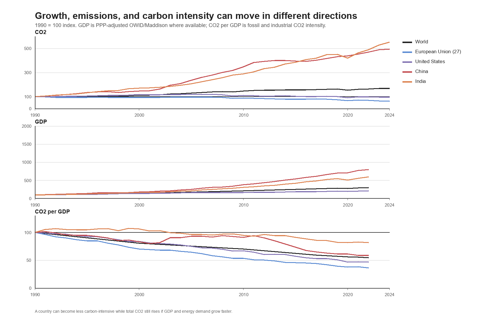
Asia’s annual CO2 rose 255.4% since 1990. China rose 394.8%. India rose 452.5%. Those increases coincide with industrialization, infrastructure buildout, manufacturing, electrification, and rising energy demand. The development-intensity chart below adds the mechanism: economies can get cleaner per unit of GDP while total emissions still rise if GDP and energy demand grow faster.
Consequence:
Fast clean development is the required goal. But treating it as frictionless is not supported by emissions history. If a climate argument says developing countries can grow, industrialize, and decarbonize without hard tradeoffs, it has to show the mechanism.
The goal of this section is not to weaken the climate case. It is to make it more honest. Bad arithmetic makes good policy harder.
The Tenth Rebuttal: Growth Still Needs Energy
One more layer is necessary:
The world cannot solve climate change by asking developing countries not to develop.
This is true.
How this was computed:
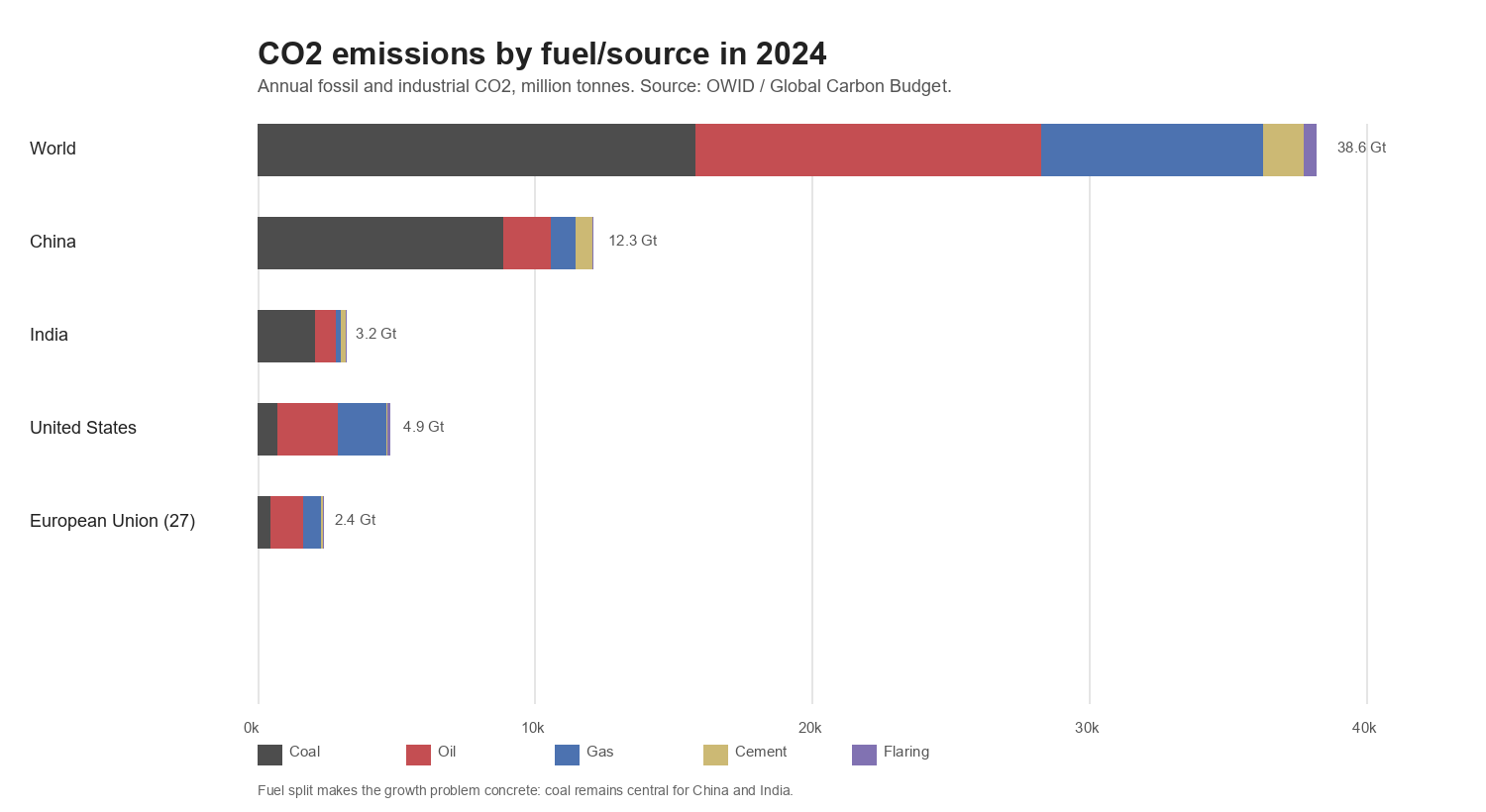
The development chart indexes CO2, GDP, and CO2 per GDP to 1990 = 100 for World, EU-27, the United States, China, and India where data are available. The fuel chart uses OWID coal_co2, oil_co2, gas_co2, cement_co2, and flaring_co2 for 2024.
Data check:
Global GDP roughly tripled from 1990 to 2022 while global CO2 rose about 70% by 2024. CO2 per GDP fell globally, and it fell in the United States, EU-27, China, and India. But total CO2 still rose sharply in China and India because their economies grew even faster than their carbon intensity fell. In 2024, coal made up about 72% of China’s CO2 and 66% of India’s CO2, compared with about 15% for the United States and 19% for EU-27.
The future of emissions depends on whether growth can be decoupled from fossil-fuel growth. Rich countries partially decoupled, but only after they became rich, built infrastructure, and in some cases shifted manufacturing abroad. Developing countries are trying to industrialize under different constraints.
The optimistic case is that solar, wind, batteries, nuclear power, electrification, grid expansion, and industrial innovation allow poorer countries to grow with lower emissions than the West did.
The pessimistic case is that cheap fossil fuels remain too useful, too available, and too politically embedded to be displaced quickly enough.
The realistic climate question lives between those two.
Consequence for the argument:
The future requirement is not simply “develop less.” It is to make development less fossil-intensive fast enough that economic growth does not keep overwhelming carbon-intensity improvements. For China and India, this especially means reducing the coal intensity of growth.
Conclusion: What The Past Was, What The Present Is, What The Future Requires
The past is clear enough.
Europe and North America industrialized first. They burned fossil fuels first. They emitted the most historically. They became rich in a world where carbon-intensive growth was normal.
The present is more complicated.
Europe has reduced annual emissions, and those reductions are real even after adjusting for consumption, though the adjustment matters. The United States and North America are a weaker story: their recent trajectory improved, but their 1990-to-latest consumption-based record is not a European-style decline. Global annual emissions kept rising because industrialization and energy demand expanded elsewhere, especially in China, India, and the rest of Asia. China is now the largest annual emitter. India is growing. The United States remains a large emitter and still looks bad on per-capita and consumption-based measures.
The future is the hard part.
If the whole world had followed Europe and North America’s post-1990 trajectory, global emissions would now be falling. They did not. That is the core fact climate policy has to explain.
The next phase cannot be solved by Europe alone, and it cannot be solved by denial. It requires making low-carbon development cheaper, more reliable, and more attractive than fossil-fuel development in the places where energy demand is still growing. It also requires rich countries to be honest about history, and developing countries to be honest about the future.
Climate seriousness should not look like panic. It should not look like symbolic austerity. It should not look like pretending China and India do not matter. It should not look like pretending Western historical responsibility does not matter.
It should look like arithmetic, engineering, economics, and diplomacy lined up around the same fact:
Global emissions only fall when the places still growing can grow without adding fossil CO2.
Findings
- Claim 1. Modern climate change is visible in direct physical measurements, not only in proxy reconstructions. Evidence: NASA GISTEMP global anomaly rises from about -0.18 C in 1880 to about +1.19 C in 2025; NOAA/NCEI 0-2000m ocean heat content rises from about 10.9 to 32.0 x10^22 joules from 2005 to 2025; Arctic September sea ice extent falls from about 7.7 to 4.7 million square kilometers from 1980 to 2025.
- Claim 2. Changing the anomaly baseline changes the zero line, not the warming trend. Evidence: Re-baselining the same NASA GISTEMP annual series from 1951-1980 to 1991-2020 shifts the series vertically while preserving the trend shape.
- Claim 3. Solar irradiance and magnetic-pole movement do not explain the modern warming pattern shown in the measured data. Evidence: NOAA Total Solar Irradiance CDR does not show the same post-1979 upward trend as NASA GISTEMP, and magnetic-pole drift is a geomagnetic navigation phenomenon rather than a measured upward energy-forcing series.
- Claim 4. Global annual fossil and industrial CO2 emissions are still much higher than in 1990. Evidence: OWID annual CO2 rises from about 22.7 billion tonnes in 1990 to about 38.6 billion tonnes in 2024.
- Claim 5. Europe reduced emissions substantially, but North America and the broader West are not a single emissions story. Evidence: Europe's territorial CO2 index falls to about 61 by 2024 while the United States is only slightly below 1990 territorially and above 1990 on consumption-based accounting.
- Claim 6. Consumption-based accounting weakens but does not erase rich-country emissions reductions. Evidence: European consumption-based CO2 falls less than territorial CO2 but still declines below 1990; the United States remains materially higher on consumption-based than territorial accounting.
- Claim 7. The current marginal emissions problem is concentrated in Asia, especially China and India, even though historical responsibility remains disproportionately Western. Evidence: From 1990 to 2024 China adds about 9.8 billion tonnes of annual CO2 and India about 2.6 billion tonnes, while Europe reduces annual CO2 by about 3.2 billion tonnes.
Limitations
- This analysis is about fossil and industrial CO2 unless stated otherwise; land-use change and non-CO2 greenhouse gases are not the primary metric.
- The physical-climate section establishes measured modern warming and consistency across indicators; it is not a full formal attribution model.
- Consumption-based CO2 data lag territorial CO2 data and are not available for every country-year through 2024.
- Regional categories can overlap in source taxonomies, so some charts use residual adjustments to reconcile broad regions to the OWID World total.
- Per-capita, cumulative, territorial, and consumption-based metrics answer different moral and policy questions and should not be collapsed into one ranking.
- The daily-temperature replication question is discussed but not implemented globally because global daily land-ocean averaging requires a separate gridding and ocean-data workflow.
References
- NASA GISTEMP v4: https://data.giss.nasa.gov/gistemp/
- NASA GISTEMP data tables: https://data.giss.nasa.gov/gistemp/data_v4.html
- NOAA Total Solar Irradiance CDR: https://www.ncei.noaa.gov/products/climate-data-records/total-solar-irradiance
- NOAA/NCEI Global Ocean Heat Content: https://www.ncei.noaa.gov/access/global-ocean-heat-content/
- NSIDC Sea Ice Index: https://nsidc.org/data/seaice_index
- World Glacier Monitoring Service data: https://wgms.ch/data_databaseversions/
- NOAA Global Historical Climatology Network Daily: https://www.ncei.noaa.gov/products/land-based-station/global-historical-climatology-network-daily
- NOAA nClimGrid Daily: https://www.ncei.noaa.gov/products/land-based-station/nclimgrid-daily
- NOAA World Magnetic Model: https://www.ncei.noaa.gov/products/world-magnetic-model
- NOAA wandering geomagnetic poles: https://www.ncei.noaa.gov/products/wandering-geomagnetic-poles
- NASA, Why Milankovitch cycles cannot explain current warming: https://science.nasa.gov/science-research/earth-science/why-milankovitch-orbital-cycles-cant-explain-earths-current-warming/
- Our World in Data CO2 data repository: https://github.com/owid/co2-data
- Our World in Data, CO2 and Greenhouse Gas Emissions: https://ourworldindata.org/co2-and-greenhouse-gas-emissions
- Skeptical Science taxonomy: https://skepticalscience.com/argument.php?f=taxonomy
Comments
Comments are powered by GitHub Discussions. You can read without signing in; posting requires a GitHub account.